Re: Contributions
Hello Thibby )
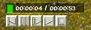
Buttons style needs to be less flat, KaM is a medieval game and that means icons are probably more sophisticated (see army controls icons for example). I don't mean they should be big though, but they should have some shading and detail in them.
We need only one icon per button, our engine does shading and pressing down automatically. Just an icon with shadow, without button background (that can be easily fixed if you have icons in layers) will be best. Of course to show a preview background is needed and if you can put all 5 buttons with icons on one strip that would be best.
Greets
I hope the stop button looks better.
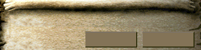
Clicked:

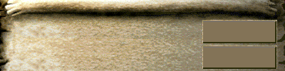
Clickable:

But I keep in mind that the users need a use-friendly module too, these signs are world known so they get their intention imediately.
Kind regards,
Thimo Braker (ThibbyRozier)
Owner of Thibmo audio productions and theater technician at Hof88 Almelo.
Thimo Braker (ThibbyRozier)
Owner of Thibmo audio productions and theater technician at Hof88 Almelo.


 . Of course if you're just doing this to see how it looks that's no problem, but for the final product just send us the icons without the button or darkened version