Page 1 of 1
Icon idea
PostPosted: 19 Nov 2011, 00:03
by Siegfried
Here we go
This is a Win Vista/7-icon with different layers (256px, 32px, 16px and those needed in between).
Your browser probably only displays the 16px layer, don't get confused, Windows Explorer will show the nice large 256px layer.
With the built-in preview function of windows, you can lok at all five layers.
Any comments?
PostPosted: 19 Nov 2011, 10:46
by T*AnTi-V!RuZz
I can only see the 16x16.. Doesn't matter if I use IE, Windows Explorer or even Photoshop..
Never mind: needed ICO plugin for Photoshop

Looks great!
PostPosted: 19 Nov 2011, 11:20
by Lewin
NICE WORK!

Comments:
- The white around the text sometimes looks kind of bad, especially in the taskbar with aero when the background isn't white. (and when Windows tries to scale them again) Can that be improved? Maybe less of a white border or no border (although that might make the letters look a bit naked)
- The text "Remake" is quite hard to read on the 32x32 layer. I think it'd be better with "KM" above that or something, as 32x32 is very commonly used and with just Remake it's hard to read and looks quite empty.
I'm curious as to how you did the font, it looks good
I was hoping someone would do this for us

A few people have tried but yours was the first with proper sized ICO layers and everything.
PostPosted: 19 Nov 2011, 12:17
by Siegfried
It was not supposed to be final, only a draft to see if you have some ideas regarding the theme.
The problem with the font border can be solved and is related to the fact, that there is only one transparency level at the moment. This is "only" a matter of time (and patience

).
How did I make the font? - Magic, duh
No, I didn't develop a complete font, I only painted the missing letters. That's all. More or less a test-run to see how difficult it would be to develop graphics for KaM.
PostPosted: 19 Nov 2011, 12:37
by Shadaoe
Nice job with the letters ! Good work !
PostPosted: 19 Nov 2011, 13:56
by Lewin
Well if you keep working on it we'll use it
I'd be interested to see what Krom thinks too.
PostPosted: 22 Nov 2011, 09:55
by Siegfried
Download
Layer 256:

Layer 48:

Layer 32:

Layer 24:

Layer 16:

I had created an additional 128 layer, but this seems to make problems.
If the 256 layer is corrupted, that's because I have an extremely poor internet connection atm. I've uploaded it 3 times, but the check failed most of the time. But the zip file works, I've checked it.
PostPosted: 22 Nov 2011, 10:48
by Encaitar
Super nice!
For those whom want the original .exe icon be replaced by this nice one like me, download the trial version of ICON MAKER (wich also has a replace function).
Here is the tutorial:
http://www.icon-maker.com/icon-changer.htm
Here the download link:
http://www.qwerks.com/download/5136/iconmaker.exe
PostPosted: 22 Nov 2011, 15:30
by Lewin
That's really awesome Siegfried
My only comment is that the 16x16 icon looks a little bit "chopped" in the taskbar/titlebar:
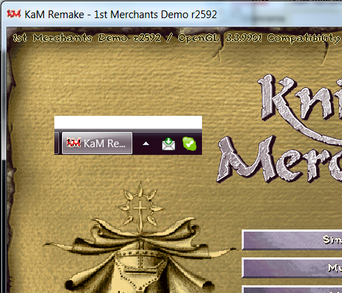
But the rest of them look great!
Lewin.
PostPosted: 22 Nov 2011, 17:14
by Danjb
Looks good! My only comments would be that the "k" of "remake" looks a lot like a capital "k". And I think I'd prefer it if the "r" of "remake" was capitalized... but that's just me being picky :/
PostPosted: 28 Nov 2011, 16:40
by Krom
Looks nice, but very raw to be a final. Letters need hinting and better antialiasing. Look at each posts statusbar - those icons are smaller than 16*16 but read much better.